Chart colours
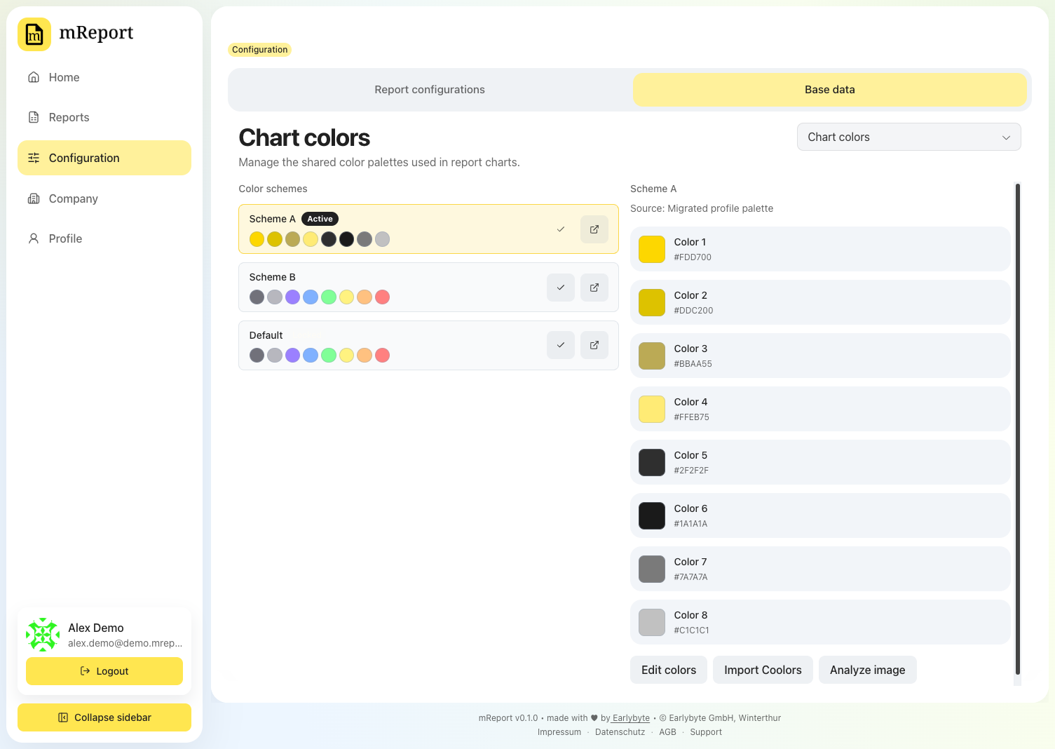
Colour schemes decide how every dashboard and PDF looks. A scheme is an ordered list of eight colours; position in that list is what assigns a colour to a chart element.
Managing schemes
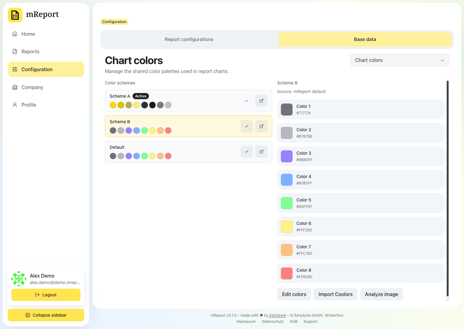
One scheme is active at a time. Selecting another one re-renders every report — no recomputation is needed, because the colours are applied when a chart is drawn.
Editing a scheme
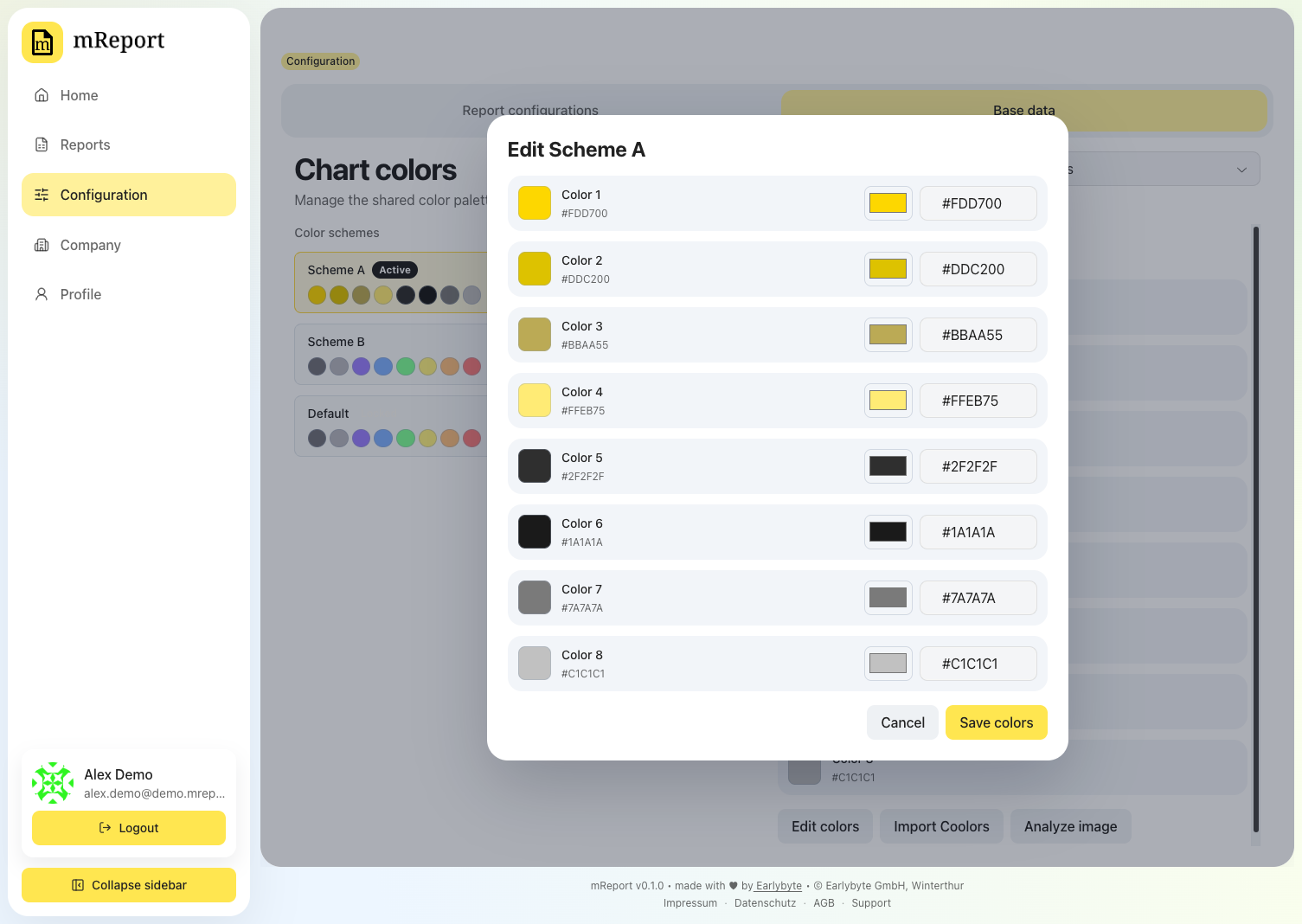
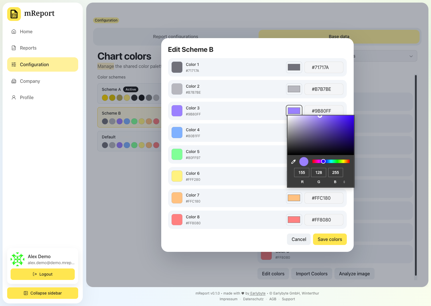
Edit opens the eight slots as hex values. Each swatch is also a colour picker.
Building a scheme from an image
Analyze image extracts a palette from a picture you upload — a brand guide page, a photo, a screenshot of a client's website.
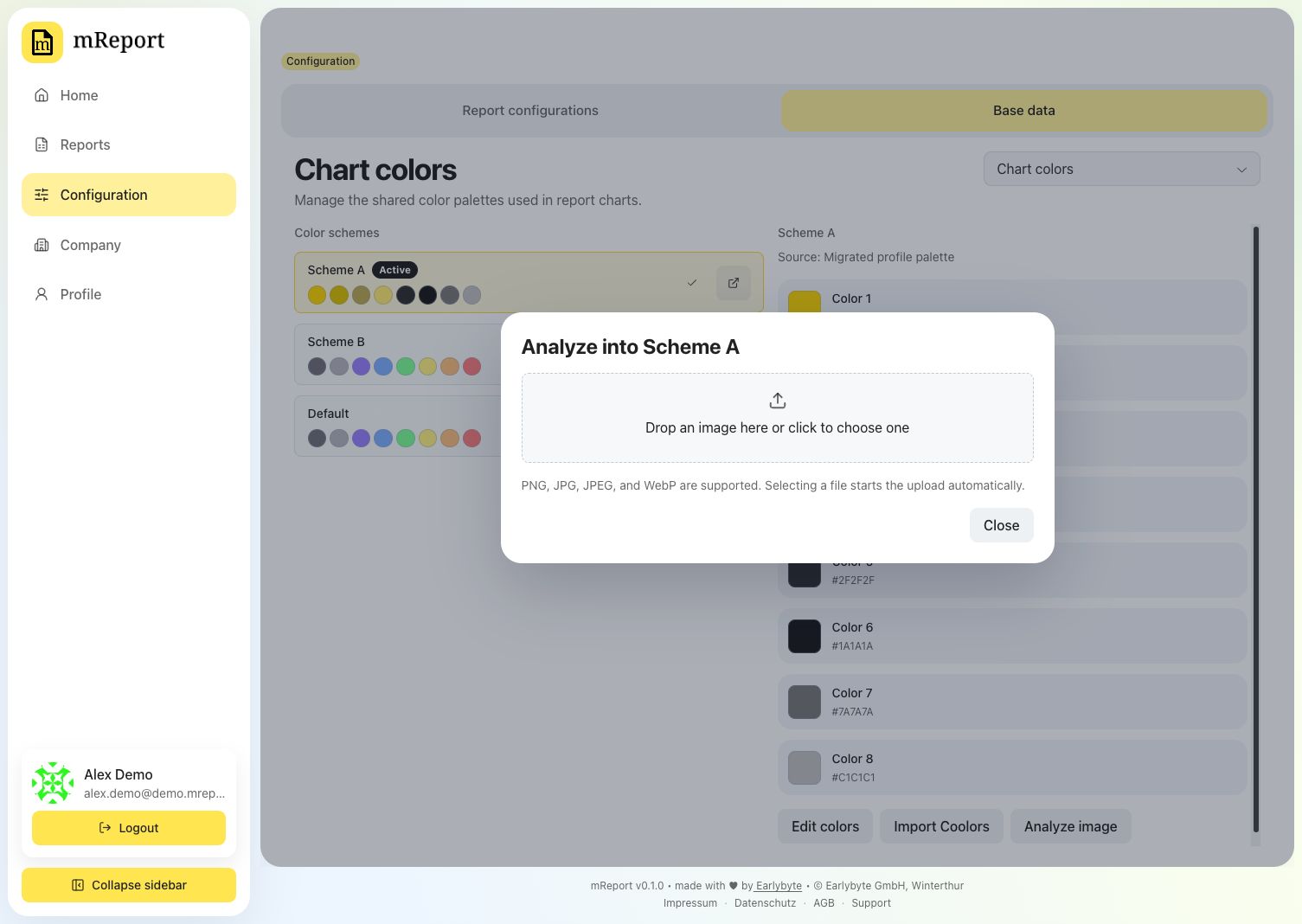
A palette from an image is a starting point
The analysis is AI-assisted and reads the colours out of the picture you upload — it works best on a logo with several distinct colours. A one- or two-colour logo gives it little to work with, and the result will be thin or repetitive.
Expect to adjust afterwards. Check the palette on a real report before keeping it: two colours that look distinct side by side in a swatch row can be hard to tell apart as thin slices of a donut or as adjacent bars. It saves you building a scheme from nothing; it is not a finished scheme.
Locked schemes
The mReport default scheme is locked and cannot be edited. Duplicate it if you want it as a starting point.
Which colour appears where
Every colour mReport draws, and where it appears. Generated from the application source, so it always matches the running version.
Generated file
Do not edit by hand. Regenerate with python saas/docs-site/generate_snippets.py.
Report palette
The eight slots of a colour scheme, in order. Slot 1 paints the first segment of a donut or the first bar in a grouped chart, slot 2 the second, and so on. Change these under Configuration → Base data → Chart colours; a scheme with fewer than eight colours is padded from this default.
| Slot | Colour | Where it appears |
|---|---|---|
| 1 | #71717A |
Segment / bar 1 of every chart |
| 2 | #B7B7BE |
Segment / bar 2 of every chart |
| 3 | #9B80FF |
Segment / bar 3 of every chart |
| 4 | #80B1FF |
Segment / bar 4 of every chart |
| 5 | #80FF97 |
Segment / bar 5 of every chart |
| 6 | #FFF280 |
Segment / bar 6 of every chart |
| 7 | #FFC180 |
Segment / bar 7 of every chart |
| 8 | #FF8080 |
Segment / bar 8 of every chart |
Client service palette
Used for the client-service line and area charts when a service has no explicit colour of its own. Set a per-service colour under Configuration → Base data → Client services.
| Slot | Colour |
|---|---|
| 1 | #9B80FF |
| 2 | #80B1FF |
| 3 | #80FF97 |
| 4 | #FFF280 |
| 5 | #FFC180 |
| 6 | #FF8080 |
Fixed roles
These two are not configurable — they always identify the same thing.
| Role | Colour |
|---|---|
| Estimate and budget lines | #71717A |
| Total hours series | #B7B7BE |
Employee calendar — worked delta
The calendar heatmap colours each day by how far the recorded hours are from the expected hours. Thresholds are the lower bound in hours; a day takes the colour of the highest threshold it reaches.
| From (hours) | Label | Colour |
|---|---|---|
| — | No reporting | #D4D4D8 |
| -4.0 | Strong negative | #78909C |
| -1.0 | Moderate negative | #2A9D8F |
| +0.0 | Near target | #5BCB67 |
| +1.0 | Positive | #E9D758 |
Employee calendar — expected hours
In expected hours mode the calendar colours each day by its type instead.
| Label | Colour |
|---|---|
| Full working day | #6ACC47 |
| Half day | #B8E05F |
| Non-working day | #80B1FF |
| Public holiday | #B83280 |
| Worked on a public holiday | #A78BFA |
| No time recorded | #D4D4D8 |